 Log in
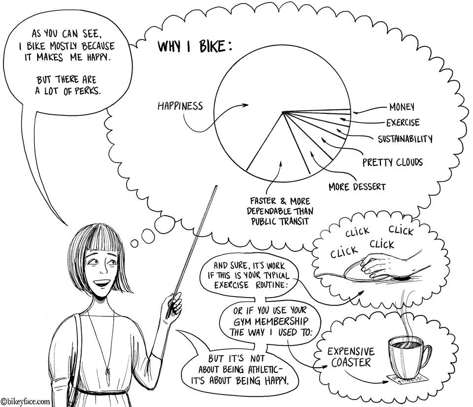
A brilliant summary of all the reasons for cycling by the excellent Bikeface!
Tagged: bikes, cycling, illustration, piecharts

|
CEO and co-founder of Typekit.
|
A brilliant summary of all the reasons for cycling by the excellent Bikeface!
Tagged: bikes, cycling, illustration, piecharts


Today’s post was authored by Dan Mall, the founder and design director of Superfriendly design studio.
In order to choose appropriate typefaces to set beautiful passages of text, it helps if we have a baseline for what constitutes ‘appropriateness’. The art and science of choosing a great typeface is in the details, and demands that we attempt to understand the fundamental building block of typography: a letter.
In his book The Elements of Typographic Style—a book I consider to be a must-read for any student of typography—Robert Bringhurst begins with this powerful phrase:
Typography exists to honor content.
If ever there was one sentiment to summarize everything ever written about typography, this is it. Some content shouts; other content whispers. Similarly, some typefaces shout while others whisper. Letters—and, by that, I actually mean glyphs—and the differences among them are what make this possible.
The right configuration of letters within the right combination of words set in the right typeface or typefaces sends the clearest messages. To see this in action, who better to study than the masters of letters: logo designers!
Perhaps the most pervasive example of a logo that demonstrates such a command of letters is the FedEx logo, designed by Lindon Leader. At first glance, it appears to be a standard employment of Futura Bold. However, upon closer inspection, it’s very clear how masterfully the letterforms were modified to create the desired shapes, most famously the arrow hidden between the “E” and the “x.”

Some of my favorite logos were created by the late Herb Lubalin. To call him a master of typography is an understatement. He’s created some incredible pieces of design:

Looking at and extrapolating from great examples can teach us some very useful lessons. Have a look at this beautiful logo by Volkan Eksi:

What a great balance of conceptual thinking without compromising readability! Why does this work so well?
Let’s look at two variations that might make this clearer. As quickly as you can, try to read each version aloud:

I’m betting version A was easier to read. (If you thought version B was easier, you probably have some special talents that you should be profiting from!) Version A is easier because the tops of English words are easier to read than the bottoms.
(For reference, here’s the full text.)

This demonstrates a valuable lesson: when modifying letterforms, it’s safer to modify the bottom than the top in order to preserve legibility. The shape of a word—which we’ll get into in just a minute—is generally more unique at the top because there’s more variation in ascenders and majuscules; keeping the top intact preserves that uniqueness. Notice that all of these great pieces of lettering have most of the ornamentation and variation at the bottom rather than the top.

Credit: Wedding lettering by James T. Edmondson, Greater by Chandler Van De Water, Melt by Agency26
Let’s look at another example that makes a different point about readability:

Version A again! (Seriously, you version B-ers really need to join the circus or something.) This one tells us that mixed case is easier to read than uppercase. The reason is because we don’t read individual letters—we react to the shapes of words. Years of reading have gotten us accustomed to what words actually look like. Uppercase text creates more rigid rectangles, decreasing readability because we lose more of the shape of the word.

You may have seen an article passed around a while ago about readability. “Aoccdrnig to a rscheearch at Cmabrigde Uinervtisy, it deosn’t mttaer in waht oredr the ltteers in a wrod are, the olny iprmoatnt tihng is taht the frist and lsat ltteer be at the rghit pclae. The rset can be a toatl mses and you can sitll raed it wouthit porbelm. Tihs is bcuseae the huamn mnid deos not raed ervey lteter by istlef, but the wrod as a wlohe.”
The reason you can still read this relatively easily is that the word shapes generally don’t change. It’s no coincidence that words whose shapes change drastically are the most difficult to read.

So, back to the Pause logo we previously discussed. Why does it work so well?

Given the simple guidelines we’ve discussed, you’re now equipped to start—or continue!—playing with letters without sacrificing legibility. Good luck!
You can catch Dan talking more about typography at his full-day workshop at Smashing Conference.

Dan Mall is the Founder & Design Director of SuperFriendly, a design studio that makes brave sites and apps for screens of all sizes. Dan is the co-founder of Typedia and The Businessology Show. Dan writes about design and other issues on Twitter as @danielmall and on his site, danielmall.com.

 |
In digital culture, we are beginning to think of our output as products and of our clients as users. “Products” might be websites, apps or communities, and they might be created by startups, agencies or a couple of people at a hackathon. This shift mainly means that we have gotten serious about asking how to better serve users, which reflects a significant change in the designer’s skill set.
Designers will use the same tools they have always used, but they are now responsible for more than just the interface. Conducting usability studies, planning design strategically over the course of a product’s lifespan, facilitating communication and — above all — “shipping” are frequent requests. Whether or not a designer calls him or herself a product designer is beside the point; to remain relevant, they need to master these new user-centered values and processes.
Designers have in the past distinguished themselves by job title, but existing titles have become inaccurate. Job expectations are no longer confined to singular tasks. Labels like user experience designer, user interface designer, interaction designer, product designer and so on may describe a person’s interests better than another, but most designers do a little of all of this, as “hybrids” (be it designer and coder, user experience and user interface designer, or designer and entrepreneur).
This trend is clearly reflected in the variety of open jobs posted. No one knows exactly who they’re looking for, so they pick the label that sounds best. Here are a few examples from the Smashing Job Board and
On the flip side, people who do the hiring understand that anyone can choose a title they like the sound of and slap that on their portfolio or business card, and that doesn’t change a designer’s level of experience or resourcefulness. The new product design world, on the other hand, is about being effective as a designer, a task rooted in real products and real people (think living portfolios and networks of people). Authenticity is getting harder to manufacture.
In high-profile opportunities, designers are expected to know UX, UI, front-end code, even how to write strategic business plans. Let’s look at a few of the requirements from a product designer job listing on Evernote (emphasis mine):
Responsibilities:
- Be a thoughtful voice for our users. You are constantly thinking about new and improved use cases and features that will appeal to our users.
- Work in small multidisciplinary product teams to help build products that are beneficial to our company and our users.
- Develop high level user stories, prototypes, design mockups, specs, and production assets.
- Define innovative user experiences that result in improved user productivity.
- Be equally comfortable working the details of your designs at a pixel level.
- Maintain a high level of visual fidelity across products.
- Be nimble. You will be working to define requirements while simultaneously designing for those requirements.
Requirements and Skills:
- Experience designing engaging user experiences for desktop, web, or mobile apps.
- Proficiency with the common suite of desktop applications used to create the wide variety of materials required to take a solution from concept through code.
- Ability to think about a problem from multiple angles to come up with the best design.
- Unique drive to continue pushing products forward and innovating.
- Proven track-record for shipping high quality experiences.
- Excellent presentation skills and attention to detail.
- Articulate and passionate verbal communicator.
- A strong sense of design theory and typography are critical.
- Ability to prototype designs in lo-fidelity and hi-fidelity as required.
- At least 3-5 years of relevant product design experience working on major product releases.
- A complete portfolio that shows breadth and depth of work.
- Experience working closely with other designers, product managers and developers.
- B.S./B.A. in related field or equivalent experience.
Please include your online portfolio on your resume or cover letter for consideration.
Individually, the requirements appear vague, but as a sum total, the message is clear: Design is no longer a “service” so much as it is a core offering in the “idea economy”:
“The service economy is going… going… soon to be gone like its predecessors in the manufacturing/industrial economy and the agricultural economy. […] The primary product of the Idea Economy is ideas. You and I can and must produce ideas just as those who prospered in previous economies had to produce crops, manufactured goods, and most recently, services.”
– Rob Brazell, founder of Overstock.com and author of The Idea Economy
These changes in culture represent a shift in the way we value design. Designers are expected to use whatever resources they have available to build upon and sell good ideas.
It’s never been easier to “sell” design ideas to non-designers. The growing support infrastructure for designers as entrepreneurs over the last few years has had a huge impact on the culture of design, particularly with the creation of The Designer Fund, a key investor in designer-led startups, and the abundance of role models of successful designer-entrepreneurs.


A plethora of designer-founders are changing the way designers are being perceived.
Having been on the hiring end of product teams, I can confidently say, yes, the portfolio is important. Yes, experience is important. Yes, an intricate mastery of our craft (typography, grids, layout, etc.) will get a designer noticed. But in addition to these skills, you can be sure that employers are looking for big-picture thinking that will directly add value to their team and their product.
“The real audience were the people out there in the real world who were going to be stuck with whatever it was I was designing. […] The more you can be their advocate, the better the design will be. That’s not just the goal of identity design, but design period.”
– Michael Bierut, in an interview with designboom
Everyone has intuition or experiences that shape their judgment in interaction design, including developers, product managers and other members of the team. And why shouldn’t they? We are all users, after all. The designer no longer lays claim to be the sole advocate of a user’s experience, and their opinion has become less relevant without evidence to back it up.
I think this has happened for a few good reasons:
Regarding the first point, a plethora of articles (such as those on Design Staff) have made it impossibly easy to do what used to be the siloed and specialized skills of human factors and user-centered design. It’s often as simple as following a set of instructions. The up-front cost, given tools like Silverback ($70) and options like UserTesting.com (from $100 for three participants), can be as minimal as paying a staff member — such as a designer — to write the testing criteria. Moreover, businesses understand that the payoff for conducting a simple study, with even just five participants, is huge compared to the risk of not talking directly to users early on.


Nielsen’s diagram depicts a diminishing amount of useful feedback after testing with just five users. (Image: Jakob Nielsen)
Paul Graham of Y Combinator talks about early testing in his essay “Do Things That Don’t Scale”:
“In software, especially, it usually works best to get something in front of users as soon as it has a quantum of utility, and then see what they do with it. Perfectionism is often an excuse for procrastination, and in any case your initial model of users is always inaccurate, even if you’re one of them. The feedback you get from engaging directly with your earliest users will be the best you ever get.”
For designers, a bit of time spent writing surveys and scenarios, creating a testing environment (however simple), making prototypes, interviewing users, gathering data and then analyzing that data are all experiences that will feed directly back into the designs. This is not about being a perfectionist, but rather about nimbly applying appropriate tools to inform good work. Design, as a utilitarian vocation, will thrive on this, and the wider acceptance of user testing in the product world will mark the transition of good design from being a veneer or ethos to being a very real part of the product.
Founders often believe that getting users and investments means being in the right place at the right time, which nearly always means now. Designers and developers are expected to keep up with this pace. If a good idea is on the table, they’d better build and release, or else someone else will beat them to the punch.


Sketch notes for minimum viable product UX (Image: Dean Meyers | Large view).
This manic environment can pose a particular kind of hardship for designers; we care about the utility of our designs, and we may even see the larger business case for launching early, but we also carry an inherent respect for the subtleties of our craft that create the larger experience and that take time (often a lot of time) to develop.
Timelines, however, rarely shift for perfection, especially in product design (and, really, they don’t need to). Does this mean that designers — if they really care — should work all hours to perfect the interface and experience before the big launch? No.
Designing for the minimum viable product (MVP) means designing with a strategy. It means knowing up front that the website will not be built responsively, but that it should be designed as if it were. It means accepting that the user experience can’t live up to MailChimp’s at first launch, but still designing with that ideal in mind. It means realizing the difference between a minimum viable product and a minimum delightful product, as well as which works for your target audience.
“You’d never find the magnetic click [from an Apple power cable] on an engineer’s list of MVP features or user stories. It’s really easy in minimal viable products to actually design the delight out of them.”
– Andy Budd, in an interview with Inside Intercom
A big challenge of MVP design lies in sacrificing your darlings for the benefit of an early release. A bigger challenge lies in knowing where to follow up and prioritize design improvements for the next release. Luckily, user testing should help with this, but a level of intuition — or awareness — is still needed to determine which piece of the puzzle should fall into place next in order to gain a clearer picture.
I like to think of good MVP design as holding on to your dreams and showing up to work every day; having a vision, but also having the practicality to break your vision into small goals.
Lastly, MVP design doesn’t mean releasing work early to be done with it. It means returning to good but difficult-to-execute ideas that arose in early planning, learning from users, and having the discipline to keep iterating. It means seeing a project through from its messy beginnings to its final finesse.
Building fast, smart and targeted necessitates a good understanding of different facets of production. Knowing what makes a product tick, the implications of how and why something is being developed in a certain way, and how best to communicate the user’s needs will put the designer in a position to design well. There is no end to the questions designers can ask; any question is relevant.
Now more than ever, design means taking off the headphones and coming out from behind the computer screen in order to talk to people, expose problems and offer solutions. As a team member who tends to see a project holistically, the designer has more opportunities to make connections between people and establish decision points to keep a project on track.
This role shouldn’t be confused with a project or product manager, because design is still a designer’s main deliverable. However, it is worth noting that the designer who communicates well will take a more central role on the team, and more often than not this is the expectation rather than the exception.
“Design is all about relationships. Unfortunately, many designers don’t fully appreciate this. Some of the best design work I’ve ever done was drinking coffee or beers with engineers, marketing people, and business development hustlers. And I wholeheartedly mean design work.”
– Daniel Burka, in The Pastry Box Project
Surviving in a digital industry means learning hard skills all the time, but communication will be a valuable soft skill for the entirety of a designer’s career. It’s worth working on.
Adam Davidson of NPR recently published an article titled “What’s an Idea Worth?” in the New York Times, writing:
“During the past few decades […] global trade and technology have made it all but impossible for any industry to make much profit in mass production of any sort. (Companies like G.E., Nike and Apple learned early on that the real money was in the creative ideas that can transform simple physical products far beyond their generic or commodity value.)”
The emphasis on “transform” is mine, because transformation is a lot like good design: It is active. Good design actively contributes to the execution of an idea.
Davidson goes on to present a compelling argument for nixing the billable hour, explaining that such a payment structure incentivizes long, boring or redundant tasks and reduces professionals to “interchangeable containers of finite, measurable units that could be traded for money.” Granted, he is talking about accountants, but this easily applies to design as well. Are we not more than the time we spend doing something? Is time-spent how we value the success of good design?


The culture of “shipping” is becoming increasingly important to designers. (Image: Busy Building Things)
In product design, the answer, of course, is no. However, it is not just the idea that matters either. A product begins with an idea, but it is ultimately evaluated by what is released into the world.
If you are a designer who has ever had to mock up every page of a website just because a client insists, then the reason for this shift becomes clear: It is much better to test work in a living prototype, so that it can be played with, iterated on and further developed.
“At the end of the day, is an iPhone and an Android not the same idea, just executed differently? Execution is what really differentiates products or companies, not ideas.”
– Ross Popoff-Walker, in Ideas Do Not Matter: Here’s Why
The penultimate value of a product is in the creative execution of the idea. In other words, what have you released lately?
“The war is over. Design has won a place on the team. We can lay down arms, fuck around in text editors, and stop fighting the battles of yesteryear. If you’re still fighting it at your company, quit and move to SF or NYC. The future is here, and it’s hiring.”
– Joshua Seiden, in “Designers Shouldn’t Code” Is the Wrong Answer to the Right Question
An army of designers, especially recent graduates, will still work in client services (and will gain valuable experience there), but this shift towards product design has far-reaching implications for all designers and the skills they are expected to contribute when they are hired.
The users, the product and the team are now integral parts of the design brief. Fortunately, it is no longer the value of design that we are fighting to get recognized, but the value of the product, and this means we have more resources at our disposal. Design doesn’t have to do it alone, but designers do need to recognize and learn the processes necessary for success in this new environment.
(al) (il)
© Cassie McDaniel for Smashing Magazine, 2013.
The following is a guest post by Pankaj Parashar. Pankaj wrote to me about some pretty cool styled progress elements he created. I asked if he'd be interested in fleshing out the idea into an article about styling them in general. Thankfully, he obliged with this great article about using them in HTML, styling them with CSS as best as you can cross-browser, and fallbacks.
Here is the basic markup for the progress element:
<progress></progress>As per the standard defined by W3C, the progress element represents the completion progress of a task. A progress element must have both a start tag (i.e. <progress>) and an end tag (i.e. </progress>), even though it looks like a replaced element (like an input). This is good though, as it helps with fallback content as we'll cover later.
Apart from the global attributes, it can have two more attributes:
max - Indicates how much task needs to be done before it can be considered as complete. If not specified the default value is 1.0.value - Indicates the current status of the progress bar. It must be greater than or equal to 0.0 and less than or equal to 1.0 or the value of the max attribute (if present).A progress bar can be in two states - indeterminate and determinate.

Based on your combination of browser and operating system, the progress bar can look different. Zoltan "Du Lac" Hawryluk covers the cross browser behavior of progress element in great depth in his article on HTML5 progress bars (which is definitely worth reading). Wufoo has some screenshots of how it looks on other operating systems on their support page for progress.
It's pretty easy to target and style an indeterminate progress bar because we know that it doesn't contain the value attribute. We can make use of CSS negation clause :not() to style it:
progress:not([value]) {
   /* Styling here */
}Throughout this article, we'll only focus on styling the determinate state of the progress bar. So let's change the state by adding the max and value attribute.
<progress max="100" value="80"></progress>Without applying any CSS, the progress bar looks like this in Chrome 29 on Mac OS 10.8.

max attribute doesn't change the state of the progress bar because the browser still doesn't know what value to represent.This is pretty much all that we can do in HTML as rest of the work is done by CSS. At this stage let's not worry about the fallback techniques for supporting older browsers that don't understand the progress element.
We can target determinate progress bars using the progress[value] selector. Using progress only is fine as long as you know that you do not have any indeterminate progress bars in your markup. I tend to use the former because it provides clear distinction between the two states. Just like any other element we can add dimensions to our progress bar using width and height:
progress[value] {
  width: 250px;
  height: 20px;
}
This is where the fun part ends and things get complicated because each category of browsers provide separate pseudo classes to style the progress bar. To simplify things, we don't really care about which versions of each browser support the progress element, because our fallback technique will take care of the rest. We classify them as follows:
Google Chrome, Apple Safari and the latest version of Opera (16+) falls into this category. It is evident from the user agent stylesheet of webkit browsers, that they rely on -webkit-appearence: progress-bar to style the appearance of progress element.

To reset the default styles, we simply set -webkit-appearence to none.
progress[value] {
  /* Reset the default appearence */
  -webkit-appearance: none;
   appearance: none;

  width: 250px;
  height: 20px;
}
On further inspecting the progress element in Chrome Developer Tools, we can see how the spec is implemented.

WebKit/Blink provides two pseudo classes to style the progress element:
-webkit-progress-bar is the pseudo class that can be used to style the progress element container. In this demo we'll change the background color, border-radius and then apply inset box shadow to the progress element container.-webkit-progress-value is the pseudo class to style the value inside the progress bar. The background-color of this element by default is green which can be verified by inspecting the user-agent stylesheet. For this demo we will create a candystrip effect using linear-gradient on background-image property.First we'll style the -webkit-progress-bar (the container):
progress[value]::-webkit-progress-bar {
  background-color: #eee;
  border-radius: 2px;
  box-shadow: 0 2px 5px rgba(0, 0, 0, 0.25) inset;
}
Next we'll style the -webkit-progress-value (the bar) with multiple gradient backgrounds. One for striping, one for top to bottom shadowing, and one for left to right color variation. We'll use the -webkit- prefix for the gradients since we're using it for the progress bar itself anyway.
progress[value]::-webkit-progress-value {
  background-image:
	   -webkit-linear-gradient(-45deg,
	                           transparent 33%, rgba(0, 0, 0, .1) 33%,
	                           rgba(0,0, 0, .1) 66%, transparent 66%),
	   -webkit-linear-gradient(top,
	                           rgba(255, 255, 255, .25),
	                           rgba(0, 0, 0, .25)),
	   -webkit-linear-gradient(left, #09c, #f44);

    border-radius: 2px;
    background-size: 35px 20px, 100% 100%, 100% 100%;
}
At the time of writing only WebKit/Blink browsers support animations on progress element. We'll animate the stripes on -webkit-progress-value by changing the background position.
@-webkit-keyframes animate-stripes {
   100% { background-position: -100px 0px; }
}

@keyframes animate-stripes {
   100% { background-position: -100px 0px; }
}
And use this animation on the -webkit-progress-value selector itself.
-webkit-animation: animate-stripes 5s linear infinite;
animation: animate-stripes 5s linear infinite;At the time of writing only WebKit/Blink browsers support pseudo elements ::before and ::after on progress bar. By simply looking at the progress bar, it is not possible to tell the actual value. We can solve this problem by displaying the actual value right at the tail-end of the progress bar using either ::before or ::after.
progress[value]::-webkit-progress-value::before {
  content: '80%';
  position: absolute;
  right: 0;
  top: -125%;
}
Interestingly, content: attr(value) doesn't work on progress bars. However, if you explicitly specify the text inside the content attribute, it works! I haven't been able to find out the reason behind this behavior. Since this works only on WebKit/Blink browsers, there is no good reason to embed content inside pseudo elements, at least for now.
Similarly, ::after is used to create nice little hinge effect at the end of the progress bar. These techniques are experimental and not really recommended to be used if you are aiming for cross-browser consistency.
progress[value]::-webkit-progress-value::after {
  content: '';
  width: 6px;
  height: 6px;
  position: absolute;
  border-radius: 100%;
  right: 7px;
  top: 7px;
  background-color: white;
}Similar to WebKit/Blink, Firefox also uses -moz-appearence: progressbar to paint the progress element.

By using appearence: none we can get rid of the default bevel and emboss. This unfortunately leaves behind a faint border in Firefox which can be removed by using border: none. This also solves the border issue with Opera 12.
progress[value] {
  /* Reset the default appearence */
  -webkit-appearance: none;
     -moz-appearance: none;
          appearance: none;

  /* Get rid of default border in Firefox. */
  border: none;

  /* Dimensions */
  width: 250px;
  height: 20px;
}
Firefox provides a single pseudo class (-moz-progress-bar) we can use to target the progress bar value. This means that we cannot style the background of the container in Firefox.
progress[value]::-moz-progress-bar {
  background-image:
    -moz-linear-gradient(
      135deg,
      transparent 33%,
      rgba(0, 0, 0, 0.1) 33%,
      rgba(0, 0, 0, 0.1) 66%,
      transparent 66%
    ),
    -moz-linear-gradient(
      top,
      rgba(255, 255, 255, 0.25),
      rgba(0, 0, 0, 0.25)
    ),
    -moz-linear-gradient(
      left,
      #09c,
      #f44
    );

  border-radius: 2px;
  background-size: 35px 20px, 100% 100%, 100% 100%;
}
Firefox doesn't support ::before or ::after pseudo classes on progress bar, nor does it allow CSS3 keyframe animation on progress bar, which gives us a slightly reduced experience.
Only IE 10+ natively supports progress bar, and only partially. It only allows changing the color of the progress bar value. IE implements value of the progress bar as the color attribute rather than the background-color.
progress[value]  {
  /* Reset the default appearence */
  -webkit-appearance: none;
     -moz-appearance: none;
          appearance: none;

  /* Get rid of default border in Firefox. */
  border: none;

  /* Dimensions */
  width: 250px;
  height: 20px;

  /* For IE10 */
  color: blue;
}The progress element is natively supported in: Firefox 16+, Opera 11+, Chrome, Safari 6+. IE10+ is partially supports them. If you want to support older browsers, you've got two options.
Lea Verou's excellent polyfill adds almost full support for Firefox 3.5-5, Opera 10.5-10.63, IE9-10. This also adds partial support in IE8. It involves including progress-polyfill.js file in your HTML and adding CSS selectors that the script file uses. To know more about its usage, check out the CSS source code of the project page.
This is my preferred (no-js) approach. It makes use of a common technique that is also used by audio and video elements.
<progress max="100" value="80">
    <div class="progress-bar">
        <span style="width: 80%;">Progress: 80%</span>
    </div>
</progress>
Simulate the look and feel of progress bar using div and span inside the progress tag. Modern browsers will ignore the content inside the progress tag. Older browsers that cannot identify progress element will ignore the tag and render the markup inside it.
.progress-bar {
  background-color: whiteSmoke;
  border-radius: 2px;
  box-shadow: 0 2px 3px rgba(0, 0, 0, 0.25) inset;

  width: 250px;
  height: 20px;

  position: relative;
  display: block;
}

.progress-bar > span {
  background-color: blue;
  border-radius: 2px;

  display: block;
  text-indent: -9999px;
}
It is fairly common to use both the techniques in conjunction and it is perfectly safe for production sites. Once you get hold of styling a single progress bar, then adding styles for multiple progress bars is merely an exercise which can be accomplished using classes.
See the Pen Skillset using HTML5 progress bars with CSS3 animations by Pankaj Parashar (@pankajparashar) on CodePen
The demo should run fine for all the browsers including Internet Explorer (up to IE 8). The progress bar color is blue in all the versions of Internet Explorer. Opera 11 and 12 doesn't permit changing the progress bar color. Hence, it shows the default green color. The demo uses additional markup to display some meta information about the progress bar and the percentage value.
For additional reading, check out the HTML5 Doctor article. It covers some similar ground but has some bits about a few additional attributes as well as how to update the bar with JavaScript if you need that.
The HTML5 progress Element is a post from CSS-Tricks
Whether you’re telling your partner they’ve made an error, or explaining to a client that you disagree with their direction, giving feedback isn’t always easy (or well-received). Leo Babauta, creator of Zen Habits, shares some tricks for giving criticism without being critical, and here are our favorites:
Read Babauta’s full post here.


 reply
reply


